Whenever I see snazzy ‘gear’ diagrams like these ones – found in the wild on places like LinkedIn or glossy consultant presentations – two immediate reactions come to mind:
1) Those little green cogs at the bottom left and top right are going to cause everything to grind to a tooth-gnashing halt, and
2) Your transformation is going to fail.
(And don’t get me started on the indicative direction of the meshing cogs)
The video below, courtesy of the Brick Experiment Channel, caught my eye as a nifty example of iterative and accumulative design problem solving. This is not constrained to the tangible world. In systems design, a problem with a basic starting point which is responded to with a simple and effective solution often spawn a series of step-up demands and higher complexity problems over time.
There can be a few reasons for this, such as:
By design – an iterative/incremental approach to problem solving beginning with a ‘minimal viable product’ (MVP) which is tested, released, and then informs subsequent design in a conscious, methodical and step-wise fashion
By evolving requirement – the subsequent problems did not present themselves until the initial problem had been resolved due to evolution of the system itself
By naivety of requirement – the clients of the solution did not realise they had additional problems to solve or believed that the initial problem to be solved was the only one
By low capability awareness – the clients of the solution were not aware that the problem was able to be solved and therefore had not applied resources to solve it
By status quo bias – the clients of the solution were emotionally anchored on the current system, despite inadequacies, and so avoided attempts to solve the problem
This is the twelfth in a series of blog posts I’ve been working on during COVID isolation. It started with the idea of refreshing my systems design and software engineering skills, and grew in the making of it.
Part 1 describes ‘the problem’. A mathematics game designed to help children understand factors and limits which represents the board game Ludo.
Part 2 takes you through the process I followed to break this problem down to understand the constraints and rules that players follow as a precursor to implementation design.
Part 3 shows how the building blocks for the design of the classes and methods are laid out in preparation for understanding each of the functions and attributes needed to encapsulate the game.
This is continued in Part 11, with some weird stuff showing up when comparing the outputs of the coded algorithms side by side.
Get in touch on Twitter at @mr_al if you’d like to chat.
One of these things is close to, but not exactly like, the other.
A Brief History of Randomness
As mentioned earlier, there were a few thoughts I had early in the game design and coding process which may explain the differences in results across parallel runs of the same algorithm in different languages. In the black box of each languages’ include files and libraries are a variety of methods for generating pseudo random numbers. There are several, often quite emotive, debates amongst mathematicians and software engineers as to how to generate a truly ‘random’ number.
Famously, the engineers at Cloudflare came up with a nifty solution derived from a patented idea by Silicon Graphics. This involved a physical implementation of a set of lava lamps, generating non-digital entropy which is then used to seed random number generation. My mind is drawn back to Douglas Adams’ description of the Infinite Improbability Drive from the Hitch Hikers’ novels, which used a strong Brownian motion producer (say, a nice hot cup of tea) as an alternative to a wall of lava lamps.
However, for the average software engineer, it is a black box. So, my next thought was that something had slipped into the code base – particularly when I was wrestling through the spacing and grammar markers that plagued me in Python – which had perverted the logic. Could an errant semi-colon or un-closed conditional mean that the code for Python and Ruby was ‘behaving’ differently to the earlier versions?
Code Walking
Time for a visual grep. You know what a ‘grep’ is, right? It is a ye olde and popular Unix/Linux command line utility for searching for pattern strings. Highly efficient and rich with options that have been tacked onto it over time. However, it’s only as good as the definition of what your looking for, and the structure of what you’re looking “in”.
When it comes to comparing code of different languages, things are a bit trickier. Yes, there are advanced search and replace style converters out there (some of which turn out some truly barbaric chunks of code, as witnessed during far-too-many Y2K code migrations). But sometimes, it’s easier to do a ‘visual grep’ – namely, print out both sets of code, and sit down with a glass of something Scottish and highly alcoholic, and go at it line by line, side by side.
Which I did.
Figure 1 – Walking through code line by line, C++ at the top, Python below
I chose the C++ version and the Python version of the Game class, mainly as it is the most complex and also because it encapsulates almost all of the game flow logic.
There had been a few weeks between producing these blocks of code, and my struggles with debugging the Python code, which meant I was very familiar with it.
What I was looking for was obvious typos, omissions or lines of code which varied markedly from method to method. My hope was that, as the old techo joke goes, that the problem “existed between the keyboard and the chair”, and that a slip of the wrist had resulted in a change in the logic flow which was causing the Python code to run very differently. (The Ruby code was a transcription of the Python code, so my working assumption was that if a mistake had been made, that it would be in the Python.)
That assumption turned out to be unfounded. I did come across some redundant code in the C++ version, which doesn’t affect game play. However, the Python version was clean. I would have to look more closely as to why games played out through that language ‘took longer’ and produce different results than their earlier counterparts.
Looking for a Smoking Gun
Again, my suspicions fell on the pseudo-random number generation (or PRNG for those who enjoy a good acronym) engine type used by each language. Each language typically has a base/common PRNG algorithm it uses to generate numbers. These in turn use one of a handful of known and trusted mathematical formulae to produce output that looks ‘close enough’ to being random for most decisions. (‘Most’ generally excludes secure encryption.)
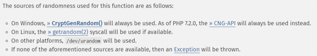
PHP’s own documentation on the random_int() function goes so far as to advise how different underpinning PRNG methods are applied depending on the platform:
That looks pretty good… but it wasn’t the default PRNG engine I’d used.
There are plenty of articles written about the use of PRNGs in simulation or gaming software. With the benefit of hindsight (and a lot of simulation runs) it now seems obvious that the formula behind the PRNG used in the C++, Java, Javascript (and probably PHP) code was the same. Ruby and Python are most likely using a formula with the intriguing name – “Mersenne Twister” – which, up to now, I’d taken to be some sort of burlesque dance move.
So, I took a version of the PHP code and went through it, replacing instances of rand() with mt_rand(). I re-ran the 49,999-run test… and the results were pretty similar to the original run.
Why? Turns out that from PHP 7.1 the code for array_rand was changed to use – you guessed it – the Mersenne Twister formula.
Outside of dice rolls, choosing a element from an array is the most-used random selection that the Auto120 game goes through. So – what if the PHP version was rolled back (along with the use of mt_rand) and the code re-run? That was next.
The Difference between Data Science and Data Analysis
I’ve been around a while. Not as long as some, but long enough to see the repeating patterns that emerge over time when it comes to Information Technology. They keep coming, too. The ‘cloud’ of today is the ‘outsourcing’ of the 90s. the “Big Data” of today is the “BI” of the 00’s. And so on. Everything’s stolen, nowadays.
Figure 3- Who uses fax machines these days?? (Except for doctors, apparently.)
There are a lot of people around who use the term ‘data science’ without understanding what it really means. It’s a pretty simple thing to consider, and those who publish on the subject argue that it is either: another name for statistics, or is not… takes into account qualitative observations, or does not… and so on.
I’m reminded of two of my favourite paradigms – one being the parable of the Blind Men and the Elephant (TL/DR: each individual, having never actually ‘seen’ an elephant, opines a strongly held opinion about what an elephant is based on a single point of data), and Niels Bohr’s reuse of an old Danish proverb “Det er vanskeligt at spaa, især naar det gælder Fremtiden” that roughly translates as: “Prediction is difficult, especially about the future”.
To whit, analysing data can tell us “what happened” but rarely tells us, precisely, what is “going to happen”.
Science is a simple discipline, made difficult by the complexities of the subject matter. The joy of marrying the words “data” and “science” is that you get a self-explanatory statement. (Despite that, I’ll explain.) The scientific method begins with making a conjecture – a hypothesis – and then designing, executing and recording the results from repeatable experiments which provide the evidence that prove this hypothesis through predictable results.
This is what I was attempting to do with developing the broader framework of the Auto120 game. Being – if you design and build an instance of an algorithm you SHOULD get repeatably consistent results in the output REGARDLESS of the language it is implemented in.
Well. Let’s break that down.
Yes, the results are consistent… but not as consistent as I would have expected. Yes, they are generally consistent across different languages. But, they’re not precisely the same. Like the wobble in Uranus’ orbit which led astronomers to discover the planet Neptune, there is something ‘different’ between two subsets of languages – with Python and Ruby in one camp, and PHP, C++, Java and Javascript in the other. And even PHP is slightly skewed.
Back to Random
So, my working hypothesis was this – the random number generator in use by PHP – being either the original algorithm or the Mersenne Twister version – could cause the data to skew. To test, the further experiment was this – 1) run a version of the 49,999 run on PHP 7.0, which pre-dated the integration of the Mersenne Twister, and 2) run a version of the 49,999 on PHP 5.6, AND replace the use of the array_rand method with a random integer selection instead.
My expectation was to see four different looking sets of data, including the original run and the follow up run where I’d substituted rand_mt.
The reality was this:
Figure 4 – Consolidated frequency plot of four different PHP runs, n=49,999
Yep. They’re the same. Almost. Look in the table below at the MODE for the two runs that DON’T use the Mersenne Twister for random number generation:
PHP
PHP-MT
PHP-5.6
PHP-7
Standard Deviation (of the PHP runs)
Average
129.06
128.83
128.99
129.58
0.33
Median
118.00
117.00
117.00
118.00
0.58
Mode
83.00
86.00
102.00
103.00
10.47
STDEV
63.48
63.75
63.40
63.64
0.15
Kurtosis
2.05
1.90
2.02
1.95
0.07
Skewness
1.15
1.14
1.15
1.14
0.01
Table 1 – Comparison of key statistical measures across the four PHP runs
The Mode, the most frequently occurring move count, is 20 moves MORE than the other runs. (But, still, 40 moves FEWER than for Ruby and Python.)
So, the random number engine did play a part. But did it play such a significant part as to impact the Python and Ruby results the way they did? It was time to run another test to find out.
Next post… having ruled out the random number engine as the significant contribution to different languages’ game behaviour, it was time to deep dive into what may have changed in the code…
This is the eleventh in a series of blog posts I’ve been working on during COVID isolation. It started with the idea of refreshing my systems design and software engineering skills, and grew in the making of it.
Part 1 describes ‘the problem’. A mathematics game designed to help children understand factors and limits which represents the board game Ludo.
Part 2 takes you through the process I followed to break this problem down to understand the constraints and rules that players follow as a precursor to implementation design.
Part 3 shows how the building blocks for the design of the classes and methods are laid out in preparation for understanding each of the functions and attributes needed to encapsulate the game.
In Part 11 this analysis continues, with some weird stuff showing up when comparing the outputs of the coded algorithms side by side.
Get in touch on Twitter at @mr_al if you’d like to chat.
Things are about to get weird and miscellaneous…
Weird Data Science
Depending on the extent of outliers, some of the statistics measures returned from a truly stochastic data set may be ridiculously large. But, in the case of the Auto120 algorithm, they shouldn’t be. This is not a true integer random number generation exercise, despite some of the game moves being based on decisions made on random numbers. It is a rules-based algorithm with a degree of randomness baked into it.
To further complicate matters, each language, each interpreter and compiler – even the platform that the code was run on – adds another noise factor. A different internal algorithm for generating random number results, a different random ‘seed’ generator, a different millisecond time stamp to feed the seed generator, etc.
This is James Gleick’s Chaos Theory writ on a macro scale. Each drop of water from the tap will fall in a different way, of a different size, in a different rhythm and frequency, based on several environmental and physical factors.
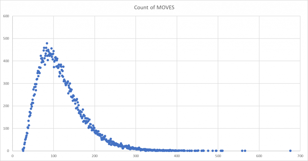
So, let’s look the graphs: [ Y axes are the frequency count of moves, X axes is the count of game moves ]
Figure 1 – Output from PHP [n=49,999]Figure 2 – Output from Java [n=49,999]Figure 3 – Output from C++ [n=49,999]Figure 4 – Output from Javascript [n=49,999]Figure 5 – Output from Ruby [n=49,999]Figure 6 – Output from Python [n=49,999]
As you scroll through these, the difference in the final two languages – Python and Ruby – compared to the earlier four languages, is obvious. If it isn’t then here are all 6 mapped on top of each other:
Figure 7 – Combined plot, all languages [n=49,999] {click for large version}
Some quick observations:
Java, C++ and Javascript appear to show a near identical pattern
PHP follows close to these, however it’s peak is not as high and the skew to the right is more apparent
Ruby and Python show a more symmetrical, albeit still right-skewed distribution. The peak is significantly lower that of the other language runs.
On removing outliers
A quick note on the C++ graph. The 49,999 game run produced five games where the move count was a clear outlier – values ranging between 3,000 and over 6,000 moves – which were at odds with the rest of the data. I’d seen this occur during testing as well.
Every now and then the C++ version of the program got into a rhythm of moves that looked as though it was ‘looping’ for several thousand iterations. It was one of the reasons I put a hard-coded exit in the iterations of the main program, so that it did not run ad infinitum and so I could trap logical errors.
In the case of this batch, there ended up being eight data points that I removed – being where there were games of over 750 moves – in order to produce a ‘corrected’ data set.
By the numbers
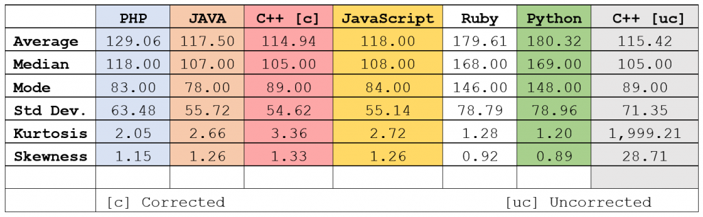
The following table, using the calculated statistical indicators rather than relying on a visual interpretation, echoes what we see in the composite graph:
Figure 8 – Statistical measures, all languages
I’ve colour coded the language columns to match the colours in the composite graph, with the exception of C++ ‘uncorrected’ which is not on the graph. Some interesting observations:
The skewness of Java and JavaScript are identical, but their kurtosis and mode vary
Ruby and Python are so close as to be almost identical. We’re talking 0.5% difference across most indicators.
The Java, Javascript and C++ distributions, indicated by the Standard Deviation, are also very similar.
C++ seemed to be the most efficient ‘player’, with the lowest number of average moves across all games – even taking into account the uncorrected run. However, Java had the lowest mode, indicating that there were a higher number of lower-move games.
I expected the runs to vary a little – but did not expect them to vary with such significance. The next step was to try and figure out why.
This is the tenth in a series of blog posts I’ve been working on during COVID isolation. It started with the idea of refreshing my systems design and software engineering skills, and grew in the making of it.
Part 1 describes ‘the problem’. A mathematics game designed to help children understand factors and limits which represents the board game Ludo.
Part 2 takes you through the process I followed to break this problem down to understand the constraints and rules that players follow as a precursor to implementation design.
Part 3 shows how the building blocks for the design of the classes and methods are laid out in preparation for understanding each of the functions and attributes needed to encapsulate the game.
In this post I seek to answer the question – did all of these languages implement the algorithm consistently, and how would we know if they did? This starts us down a path of data analysis and how to find patterns in large sets of data.
Get in touch on Twitter at @mr_al if you’d like to chat.
Credit: Demetri Martin’s “My Ability to draw Mountains over time”
Looking for “Something Interesting”
So, I’d interpreted the algorithm, implemented it in several languages, and was then thinking… now what?
Sure, there were more languages to explore, and variations on those already knocked on the head, such as.GUI or mobile platform versions. But, I wanted to see how it would scale, and whether the same algorithm executed in different languages produced consistent results.
I did Stats 1-0-1 at university as part of my post-grad studies… they called it ‘Data and Decisions’ as it was a business school. I learned enough to be dangerous and to dive down the rabbit hole that consisted of looking at large data sets from different angles seeking, as my lecturer put it, “Something Interesting”.
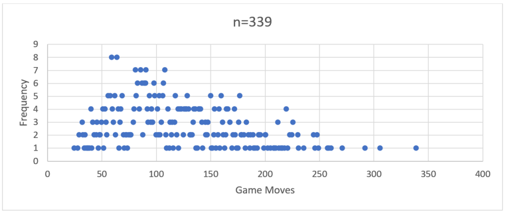
To him, “interesting” meant “odd, unexplained, or insightful”. I interpreted that slightly different, outside of “ohh look, pretty graph!” and plotting R-regressions. (and, thanks to my science and engineering alumni, always remembering to label my axes.). Initially I did a run of just over 300 games using the PHP version and recorded the total number of moves before there was a clear winner. For example:
Figure 2 – PHP-run distribution curve showing frequency of total game moves over a run of 339 games
If you squint closely you can see the ghostly outline of a bell-shaped frequency curve.
So, then I ran a comparison with 2,200 games through the Java version.
Figure 3 – Java-run distribution curve showing frequency of total game moves over a run of 2,200 games
There you go – a more distinct bell curve with a long right hand tail – a distinct positive skew.
The more of these large ‘runs’ of games I performed across the different language implementations, the more a ‘visual’ pattern emerged. This was characterised by a frequency peak in the early 100’s followed by a long tail reaching out to the mid-600s or higher.
My stats 1-0-1 training gave me some basic tools to look beyond the simple shape of the curve, particularly when it came to comparing how these models differed from language to language.
However, my working hypothesis was this – a standard algorithm based on logical decision making should produce near identical results regardless of the language it was coded in.
Makes sense, right? If every ‘language’ is interpreting and following the same set of rules, and making the same decisions based on these, then the results should be the same. But they were not.
In saying that, and to butcher some Orwell, some were more equal than others. The best way to demonstrate this was to execute a batch run of 49,999 games for each language and compare the results. Why 49,999? Turns out it is the largest prime number short of 50,000. And I love me a good prime.
Performing Large Runs
These 6 batch runs occurred simultaneously, albeit through a few different execution methods.
The PHP and Javascript code was served up and run from a cPanel based web hosting platform, with the PHP code running server-side and displaying results to the browser client, and the Javascript running and displaying on the browser (Chrome).
The C++ and Python code fully compiled into a distributed executable. The batches were triggered through a Windows Powershell app running in a command shell window. The Ruby and Java code was also batched through Powershell, but calling the installed run-time environment. i.e.
For Java, this was running: java -classpath Auto120 Auto120.auto120
And for Ruby it was: powershell -ExecutionPolicy Bypass -File auto120.ps1
…where auto120.ps1 contained the simple command: ruby main.rb
(Side note – the execution policy bypass in the Ruby script was to get around security issues baked into Windows 10 to prevent the running of malicious code.)
Analysing the Data using Excel
Now that we had six sets of 49,999 data points, there needed to be consistency in how this was modelled. Excel has simple built in tools to support this, and I used them as follows:
A. Normalise the data as a sequence of games with the number of total moves per game.
A spreadsheet with labelled columns holds the game sequence number (not used but useful to uniquely identify the data) and the ‘moves’ which is stripped from the ‘FINAL MOVE:’ output at the end of each game.
Figure 4 – Subset of the data for a large run. Column A contains the game-run sequence, column B holds the total number of game moves for that game.
B. Calculate the frequency of games that have the same number of moves.
Selecting the table created in step ‘a’, create a Pivot Table calculating the ‘Count of Moves’ alongside the ‘Moves’ as a row will return a grouped table. In the first column will be the number of game moves, in the second column will be the frequency (count) of games which were completed with that number of moves.
Figure 5 – Using a Pivot Table to aggregate data into frequency groupings, giving the total number of games from the data set which have an identified number of game moves.
C. Graph this frequency against consistently scaled axes, clipping off outliers where necessary.
The output from step ‘b’ gives us an ‘x’ axis (Row Labels) and a ‘y’ axis (Count of Moves) to plot. Excel doesn’t like plotting a Scatter Graph directly from a Pivot Table, so a bit of cut-and-paste-values is needed to recreate this table.
You could do a straight-up histogram (vertical columns rather than data points); however, the visual impact of the shape of the graphs and the clustering of data points is not as obvious.
Figure 6 – Creating a frequency distribution graph from the grouped data
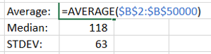
D. Calculate the average, median, mode and standard deviation
Again, Excel and its pre-baked formulae comes to the rescue, with AVERAGE, MEDIAN, MODE and STDEV.
Figure 7 – Getting Excel to do the hard work of calculating statistics
The ‘input’ for these is the ‘Moves’ column created in step ‘a’. These three calculations provide a useful marker to answer the question: Are we looking at similar sets of data?
A quick note on averages
By itself, I dislike using ‘Average’ as a sole indicator of data consistency. As a colleague once pointed out, on ‘average’ any given human population is assigned 50% male and 50% female at birth. So, it is fairly useless as a large-scale differentiator.
‘Median’ adds flavour to this by identifying the central point of the data when sorted from lowest to highest. Including the most frequently occurring data point – ‘Mode’ – gives you an idea of the landscape of data. ‘Standard Deviation’ takes a bit to get your head around, but in short gives you a measure of how dispersed the data is from the average point.
Combined these statistical indicators provide us with a mathematically sound set of measures by which we can compare like-for-like sets of data.
Additional considerations
E. Calculate the skewness (symmetry of the frequency curve) and kurtosis (clustering of data points in the peak or curves)
A numerical way of analysing the distribution curves – skewness tells us how much of the data is clustered to the left or right of the distribution. A perfect skewness – close to zero – means a near perfect symmetry in what is termed a ‘normal distribution’. A positive, or ‘right’ skew, means that most of the data points are at a value higher than the average, median and mode values. A negative, or ‘left’ skew, means the opposite.
Again, Excel comes to the rescue with the simple ‘KURT’ and ‘SKEW’ formula, into which the same superset of ‘Moves’ data points can be run.
A simple way of understanding kurtosis is how tight the ‘tails’ of the distribution are. A tall, narrow distribution will have a low kurtosis value. A flat, wide distribution or one that has a particularly skewed tail will have a higher kurtosis value.
So – enough of Stats 1-0-1. I now had six large sets of data, a standard way of comparing these and a curiosity to understand what had happened from the initial design of the algorithm, through to the coding and now viewed through the output?