
This is the tenth in a series of blog posts I’ve been working on during COVID isolation. It started with the idea of refreshing my systems design and software engineering skills, and grew in the making of it.
Part 1 describes ‘the problem’. A mathematics game designed to help children understand factors and limits which represents the board game Ludo.
Part 2 takes you through the process I followed to break this problem down to understand the constraints and rules that players follow as a precursor to implementation design.
Part 3 shows how the building blocks for the design of the classes and methods are laid out in preparation for understanding each of the functions and attributes needed to encapsulate the game.
In Part 4 we get down to business… producing the game using the programming language PHP with an object orientated approach.
Part 5 stepped it up a notch and walked through a translation of the code to object orientated C++.
Part 6 delves into the world of translating the code into object-orientated Java.
In Part 7 the same code is then translated into Javascript.
In Part 8 I slide into the sinuous world of Python and learn a thing or two about tidy coding as I go.
Part 9 explored the multi-faceted world of Ruby.
In this post I seek to answer the question – did all of these languages implement the algorithm consistently, and how would we know if they did? This starts us down a path of data analysis and how to find patterns in large sets of data.
Get in touch on Twitter at @mr_al if you’d like to chat.

Looking for “Something Interesting”
So, I’d interpreted the algorithm, implemented it in several languages, and was then thinking… now what?
Sure, there were more languages to explore, and variations on those already knocked on the head, such as.GUI or mobile platform versions. But, I wanted to see how it would scale, and whether the same algorithm executed in different languages produced consistent results.
I did Stats 1-0-1 at university as part of my post-grad studies… they called it ‘Data and Decisions’ as it was a business school. I learned enough to be dangerous and to dive down the rabbit hole that consisted of looking at large data sets from different angles seeking, as my lecturer put it, “Something Interesting”.
To him, “interesting” meant “odd, unexplained, or insightful”. I interpreted that slightly different, outside of “ohh look, pretty graph!” and plotting R-regressions. (and, thanks to my science and engineering alumni, always remembering to label my axes.). Initially I did a run of just over 300 games using the PHP version and recorded the total number of moves before there was a clear winner. For example:
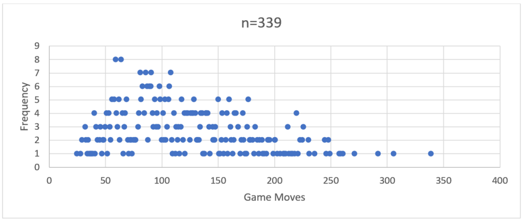
If you squint closely you can see the ghostly outline of a bell-shaped frequency curve.
So, then I ran a comparison with 2,200 games through the Java version.

There you go – a more distinct bell curve with a long right hand tail – a distinct positive skew.
The more of these large ‘runs’ of games I performed across the different language implementations, the more a ‘visual’ pattern emerged. This was characterised by a frequency peak in the early 100’s followed by a long tail reaching out to the mid-600s or higher.
My stats 1-0-1 training gave me some basic tools to look beyond the simple shape of the curve, particularly when it came to comparing how these models differed from language to language.
However, my working hypothesis was this – a standard algorithm based on logical decision making should produce near identical results regardless of the language it was coded in.
Makes sense, right? If every ‘language’ is interpreting and following the same set of rules, and making the same decisions based on these, then the results should be the same. But they were not.
In saying that, and to butcher some Orwell, some were more equal than others. The best way to demonstrate this was to execute a batch run of 49,999 games for each language and compare the results. Why 49,999? Turns out it is the largest prime number short of 50,000. And I love me a good prime.
Performing Large Runs
These 6 batch runs occurred simultaneously, albeit through a few different execution methods.
The PHP and Javascript code was served up and run from a cPanel based web hosting platform, with the PHP code running server-side and displaying results to the browser client, and the Javascript running and displaying on the browser (Chrome).
The C++ and Python code fully compiled into a distributed executable. The batches were triggered through a Windows Powershell app running in a command shell window. The Ruby and Java code was also batched through Powershell, but calling the installed run-time environment. i.e.
For Java, this was running:
java -classpath Auto120 Auto120.auto120
And for Ruby it was:
powershell -ExecutionPolicy Bypass -File auto120.ps1
…where auto120.ps1 contained the simple command:
ruby main.rb
(Side note – the execution policy bypass in the Ruby script was to get around security issues baked into Windows 10 to prevent the running of malicious code.)
Analysing the Data using Excel
Now that we had six sets of 49,999 data points, there needed to be consistency in how this was modelled. Excel has simple built in tools to support this, and I used them as follows:
A. Normalise the data as a sequence of games with the number of total moves per game.
A spreadsheet with labelled columns holds the game sequence number (not used but useful to uniquely identify the data) and the ‘moves’ which is stripped from the ‘FINAL MOVE:’ output at the end of each game.

B. Calculate the frequency of games that have the same number of moves.
Selecting the table created in step ‘a’, create a Pivot Table calculating the ‘Count of Moves’ alongside the ‘Moves’ as a row will return a grouped table. In the first column will be the number of game moves, in the second column will be the frequency (count) of games which were completed with that number of moves.

C. Graph this frequency against consistently scaled axes, clipping off outliers where necessary.
The output from step ‘b’ gives us an ‘x’ axis (Row Labels) and a ‘y’ axis (Count of Moves) to plot. Excel doesn’t like plotting a Scatter Graph directly from a Pivot Table, so a bit of cut-and-paste-values is needed to recreate this table.
You could do a straight-up histogram (vertical columns rather than data points); however, the visual impact of the shape of the graphs and the clustering of data points is not as obvious.

D. Calculate the average, median, mode and standard deviation
Again, Excel and its pre-baked formulae comes to the rescue, with AVERAGE, MEDIAN, MODE and STDEV.
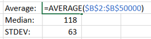
The ‘input’ for these is the ‘Moves’ column created in step ‘a’. These three calculations provide a useful marker to answer the question: Are we looking at similar sets of data?
A quick note on averages
By itself, I dislike using ‘Average’ as a sole indicator of data consistency. As a colleague once pointed out, on ‘average’ any given human population is assigned 50% male and 50% female at birth. So, it is fairly useless as a large-scale differentiator.
‘Median’ adds flavour to this by identifying the central point of the data when sorted from lowest to highest. Including the most frequently occurring data point – ‘Mode’ – gives you an idea of the landscape of data. ‘Standard Deviation’ takes a bit to get your head around, but in short gives you a measure of how dispersed the data is from the average point.
Combined these statistical indicators provide us with a mathematically sound set of measures by which we can compare like-for-like sets of data.
Additional considerations
E. Calculate the skewness (symmetry of the frequency curve) and kurtosis (clustering of data points in the peak or curves)
A numerical way of analysing the distribution curves – skewness tells us how much of the data is clustered to the left or right of the distribution. A perfect skewness – close to zero – means a near perfect symmetry in what is termed a ‘normal distribution’. A positive, or ‘right’ skew, means that most of the data points are at a value higher than the average, median and mode values. A negative, or ‘left’ skew, means the opposite.
Again, Excel comes to the rescue with the simple ‘KURT’ and ‘SKEW’ formula, into which the same superset of ‘Moves’ data points can be run.
A simple way of understanding kurtosis is how tight the ‘tails’ of the distribution are. A tall, narrow distribution will have a low kurtosis value. A flat, wide distribution or one that has a particularly skewed tail will have a higher kurtosis value.
So – enough of Stats 1-0-1. I now had six large sets of data, a standard way of comparing these and a curiosity to understand what had happened from the initial design of the algorithm, through to the coding and now viewed through the output?
More to be revealed in my next post, where the data is compared and patterns revealed.